
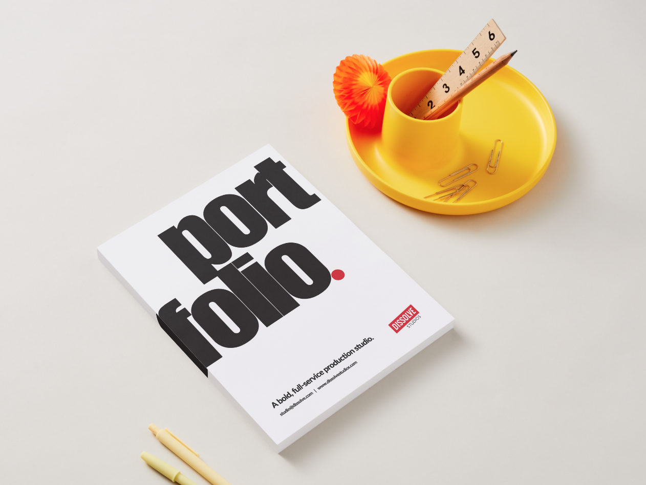
Dissolve Studios: Brand Creation & Web Design
2025
Creative Direction · Brand Identity · Web Design
Dissolve Studios was developed as a new creative extension of the Dissolve brand, requiring both a visual identity and a digital presence. It was important this child-company felt connected to the parent company while still establishing its own voice. This initiative was driven in part by the changing landscape with AI, which opened new creative possibilities and shifted market expectations.
I led the brand and website design, shaping the visual direction, structure, and overall experience from early concept through execution. This included: developing the identity system, defining how the brand should translate online, and designing a site that clearly communicated the studio’s offerings. The goal was to create a foundation that felt cohesive, modern, and ready to support future creative work.
Overview
+2 weeks
Timeline
Toolkit
Milanote, Adobe Creative Suite, Wix
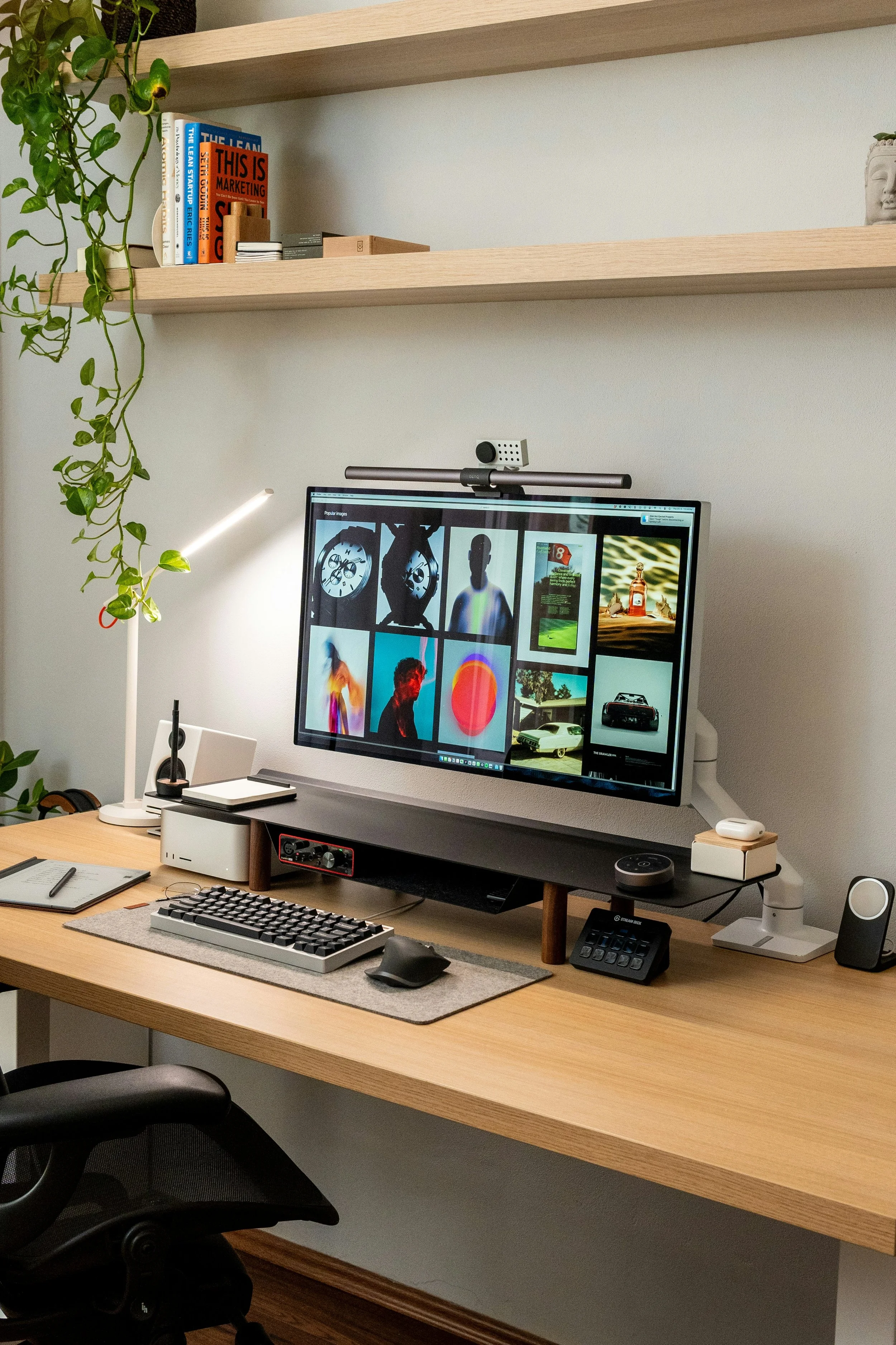
How might we create a brand and website that feel distinct yet connected to Dissolve, while clearly communicating the studio’s purpose and future potential?
The challenge
The design process began with defining how Dissolve Studios should position itself in relation to the parent brand, Dissolve. We first identified what felt familiar and what needed to stand apart.
From there, we explored visual direction, typography, and layout systems that could translate seamlessly across both brand and web. The website was designed in parallel with the identity, allowing structure, messaging, and visuals to evolve together.
Brand styling & positioning
Design process
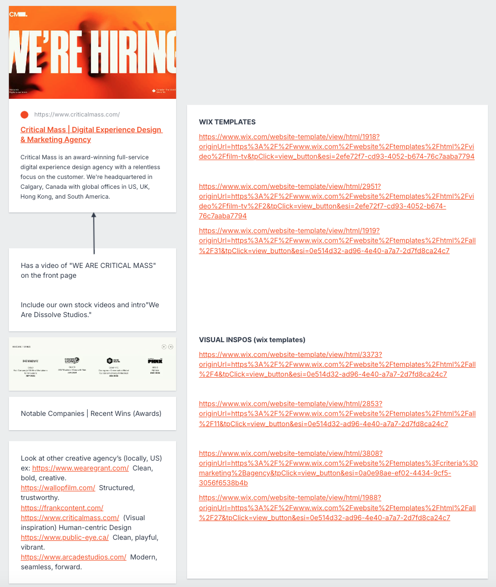
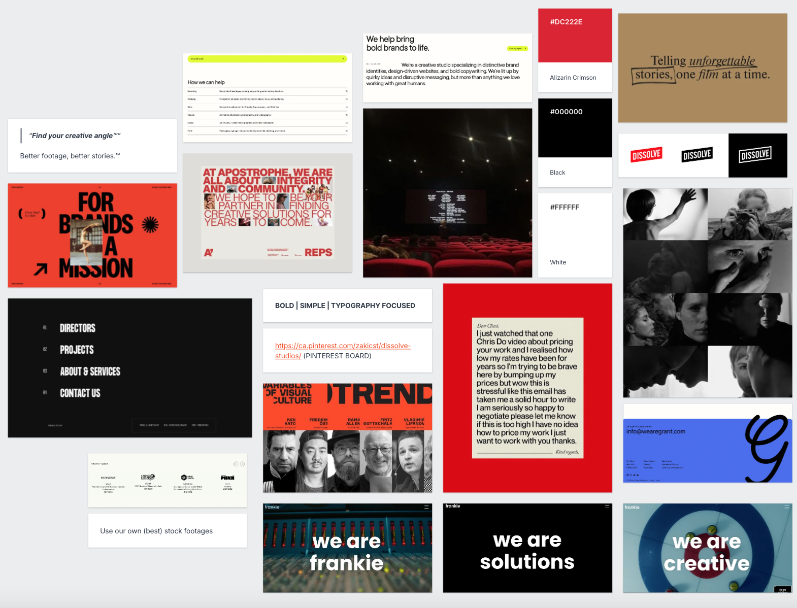
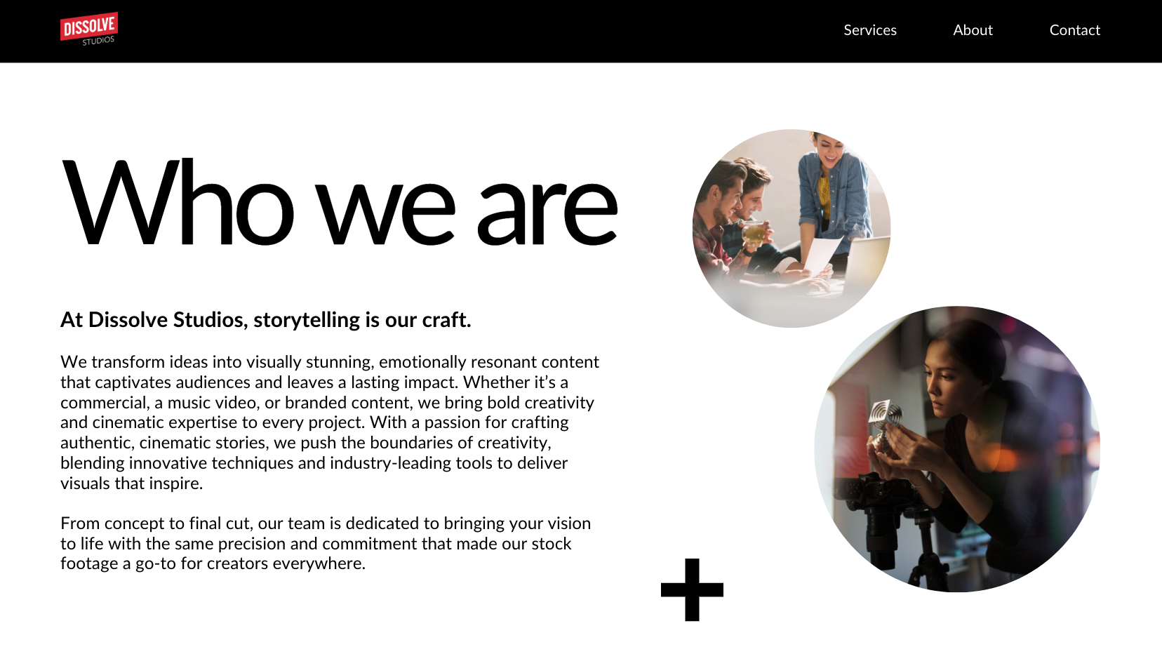
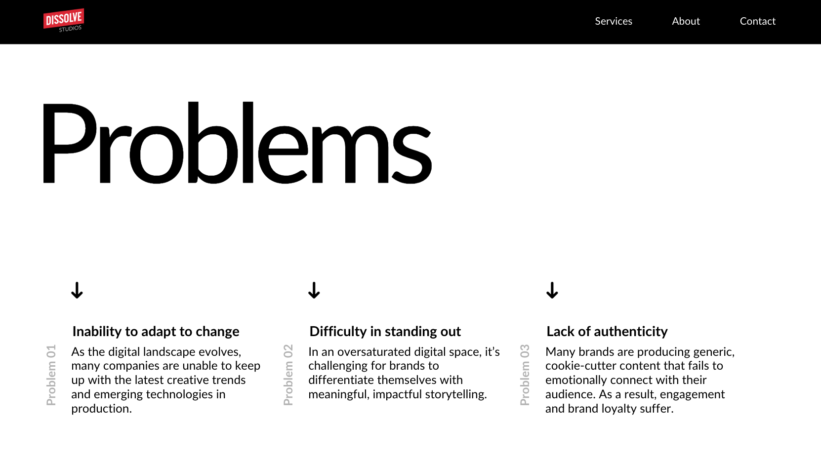
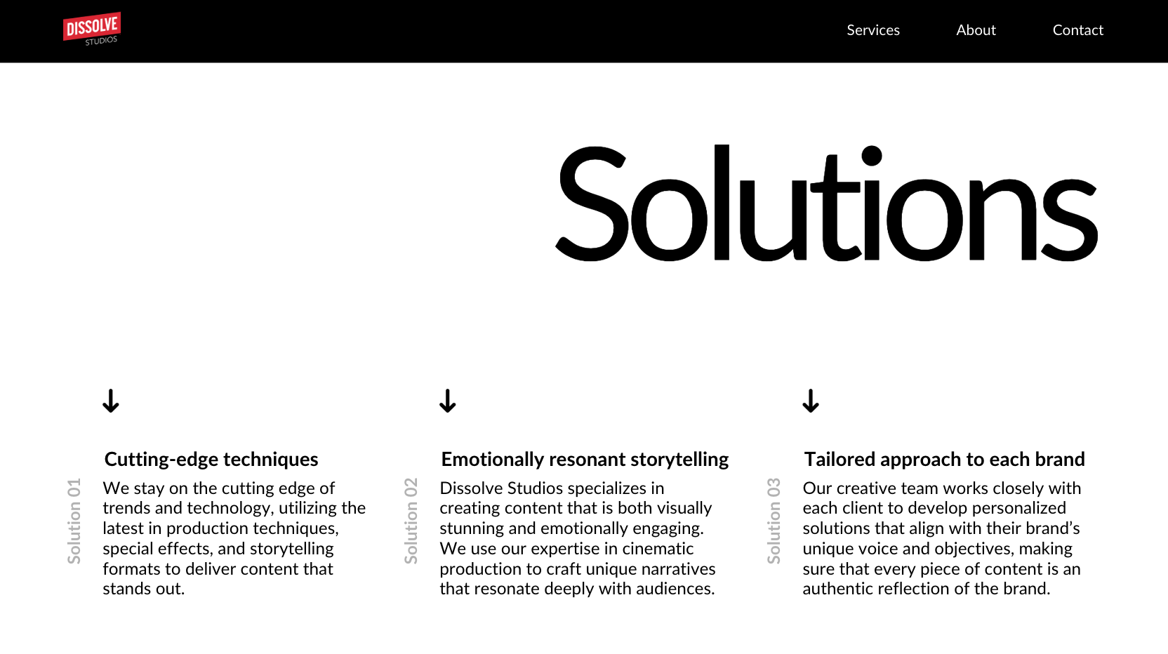
As part of the brand development, I created a foundational narrative framework that lived within the brand guidelines and pitch materials. These layouts were designed to help articulate how Dissolve Studios positions itself, moving from client challenges to who we are and how we solve them.
The goal was to give the studio a clear storytelling structure that could be used across proposals, presentations, and future marketing materials.
By defining this “problems → identity → solutions” flow early, the brand could communicate its value consistently, not just visually, but strategically.
Client review & brand development
Design process
The design is restrained and cohesive, prioritizing legibility and pacing so each poem can breathe while the collection reads as a unified whole. I supported the KDP publishing process—advising on formatting and proof checks—and the author was very pleased with the polished final product.
Final website layout
Design solution
