

Resilience in the Stock Footage Industry
2024 - 2025
Creative Direction · Campaign Strategy · Visual Design
Dissolve™, a leading platform for premium stock photo and video, began navigating a rapidly shifting landscape as AI-generated media reshaped expectations and introduced new uncertainty into the stock content economy. In response, our focus turned toward strengthening engagement, differentiating our offering, and reinforcing the value of authentic, human-made work. At the same time, we explored how AI could be thoughtfully integrated into our workflows and platform.
As Creative Manager, I led key marketing and content initiatives aimed at maintaining relevance and visibility during this transition. Through showreels, site promotions, and strategic content direction, I helped shape how Dissolve communicated its value in an increasingly AI-driven market, ensuring our brand remained distinctive, engaging, and creatively competitive.
Overview
Timeline
Ongoing updates over 2024 & 2025.
Toolkit
Trello, Adobe Creative Suite, Canva, Userbrain

How might we strengthen brand relevance and engagement across external and internal touchpoints in a rapidly changing stock media landscape?
The challenge
Areas of impact

Strategy, storytelling, and creative execution across social and showreel formats.

Campaign visuals and messaging designed to drive engagement and conversion.


Company documents and materials that supported alignment, communication, and consistency.
Campaign visuals and messaging designed to drive engagement and conversion.
Site-wide promotions
2.0
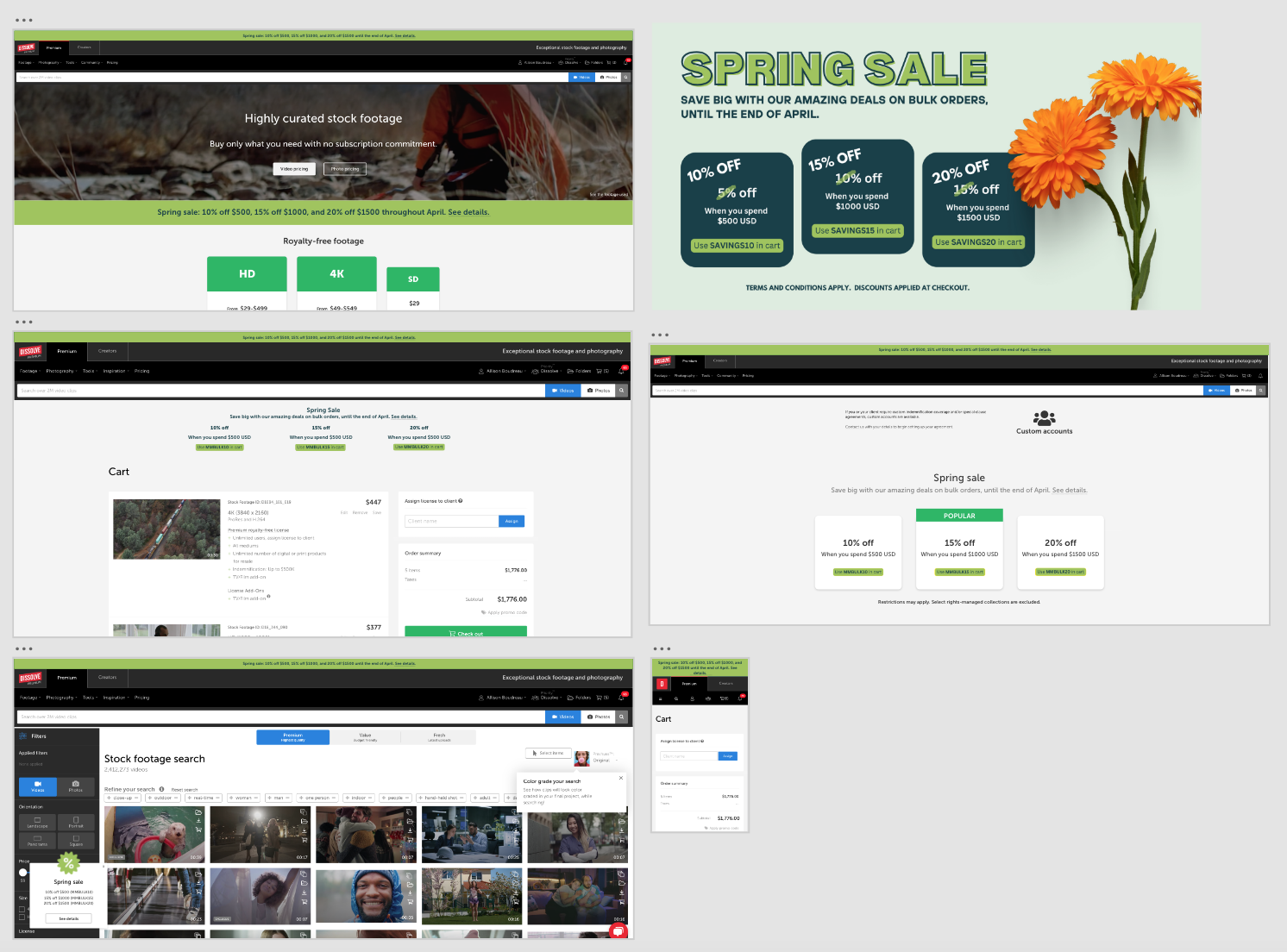
Spring Sale Campaign
Screenshot of copy & visuals created for onsite messaging for the spring sale campaign.
For the Spring Sale campaign, I developed both the copy and visual system to ensure the promotion felt cohesive, clear, and aligned with Dissolve’s brand. I focused on concise, value-driven messaging that communicated tiered savings at a glance, while maintaining a tone that felt elevated rather than overly promotional.
Visually, I paired bold, high-contrast offer cards with seasonal elements to create eye catching messaging without disrupting the site’s clean UI structure. The layout was designed to integrate seamlessly across the homepage, search results page, cart, and checkout path. This ensured the campaign felt consistent throughout the full user journey.
By aligning messaging hierarchy, promotional codes, and visual emphasis, the campaign supported both discoverability and conversion while maintaining brand integrity.
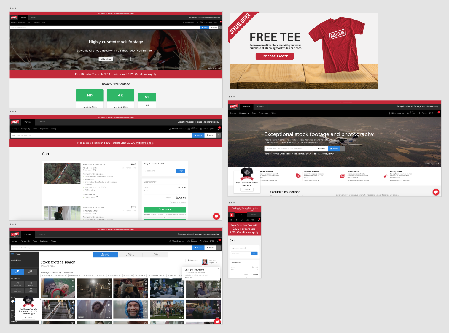
Free Tee Campaign
Screenshot of copy & visuals created for onsite messaging for the free tee campaign.
This campaign was built around a merchandise-driven promotion designed to reward higher-value purchases while reinforcing brand affinity. I developed the core messaging to clearly communicate the free T-shirt offer, eligibility threshold, and redemption steps, ensuring the value proposition was instantly understood across all touchpoints.
Visually, the campaign leaned into bold red accents, product-focused imagery, and simple, high-contrast callouts to create a sense of immediacy and excitement without overwhelming the browsing experience. The promotion was implemented across the homepage, search, cart, and checkout to keep the offer visible at key decision moments, reinforcing incentive and encouraging completion.
By aligning copy clarity with consistent visual placement, the campaign positioned the promo as both a functional conversion driver and a brand-building moment.
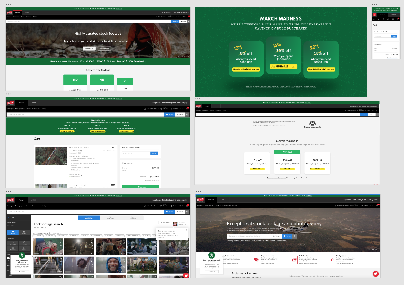
March Madness Campaign
Screenshot of copy & visuals created for onsite messaging for the march madness campaign.
This campaign centered around a tiered “March Madness” promotion designed to drive higher cart values through progressive bulk discounts. I developed the campaign concept, promotional structure, and messaging to clearly communicate increasing savings at key spending thresholds, making the incentive easy to understand at a glance.
The copy leaned into the March Madness theme with energetic, sports-inspired language while maintaining clarity around eligibility and promo code usage. Visually, the campaign adopted a bold green palette and bracket-inspired layout to reinforce the seasonal theme without overwhelming the core UI. The promotion was integrated consistently across the homepage, cart, search, and custom account pages to ensure visibility at critical decision points.
Overview
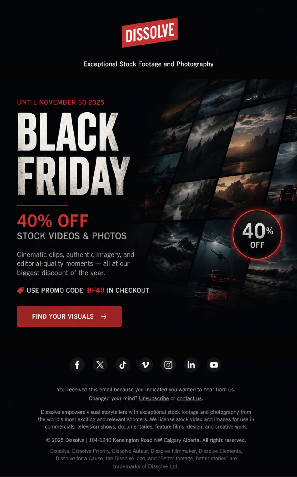
For Dissolve’s 2025 Black Friday promotion, I designed and executed a multi-touch email campaign promoting 40% off stock video and photography. The campaign ran throughout November and used a consistent visual system across multiple sends while allowing for incremental creative and messaging adjustments as the promotion progressed.
The goal was to create a strong sense of urgency around Dissolve’s biggest promotional period of the year while keeping the campaign visually aligned with the brand and focused on driving customers back to the stock library.
The challenge
Black Friday required more than a single promotional email. The offer needed to remain recognizable across repeated customer touch points without making every send feel identical.
The campaign needed to:
Clearly communicate the 40% off offer
Establish urgency as the November 30 deadline approached
Maintain a recognizable visual identity across multiple sends
Direct customers toward the Dissolve stock library
Support secondary customer needs, including research assistance
Keep the promotional experience consistent with Dissolve’s existing brand
Promotional email campaign
3.0
Iterative campaign design
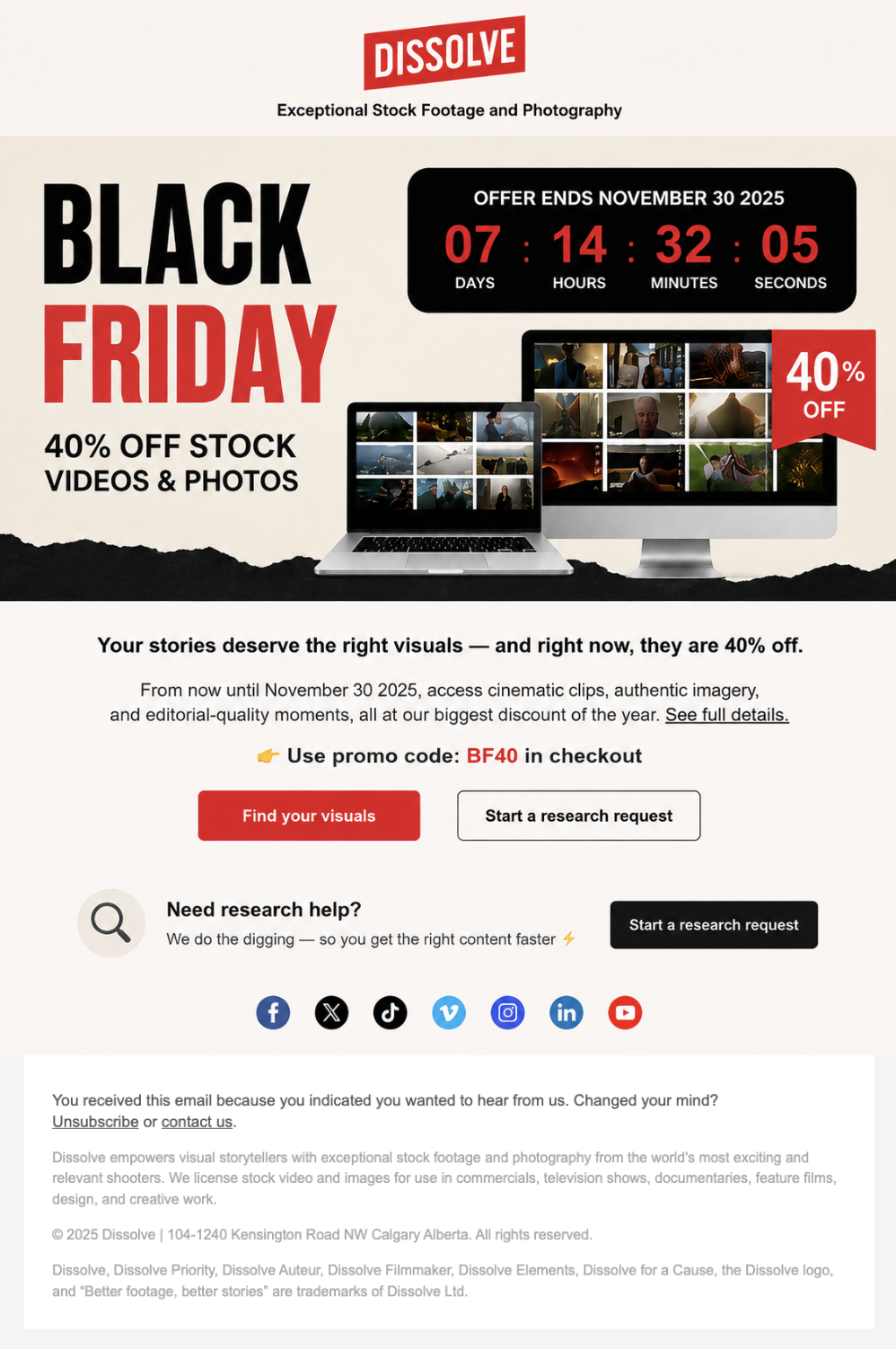
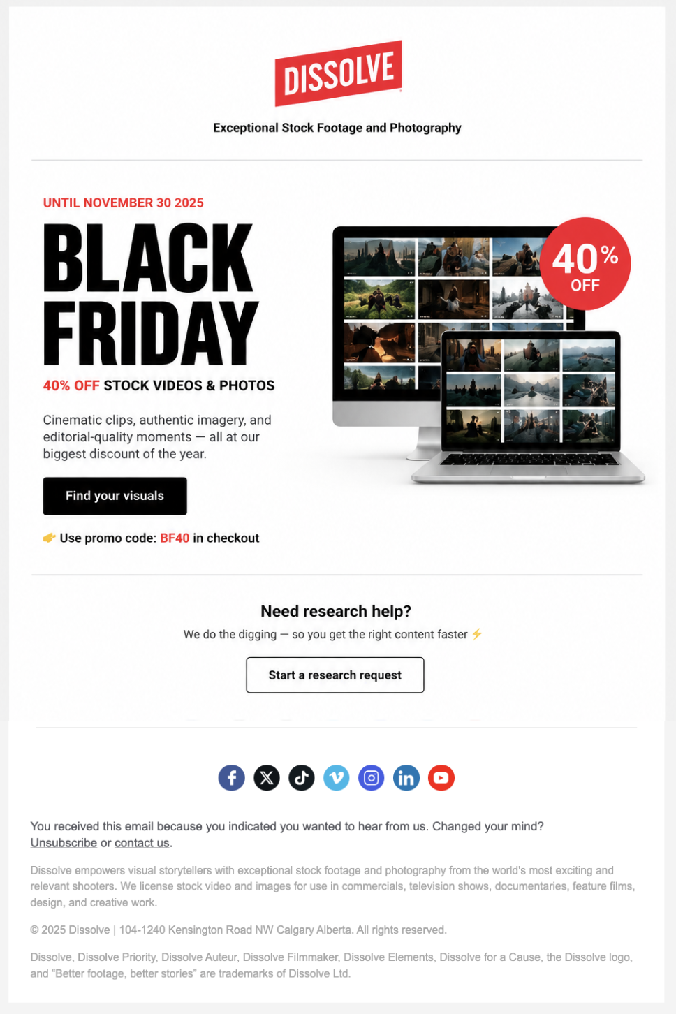
Rather than treating each email as a completely separate design, I created a cohesive campaign system that could be adapted throughout the promotional period.
Across the campaign, I made incremental adjustments to elements such as:
Hero imagery
Promotional emphasis
Headline and supporting messaging
CTA treatment
Visual emphasis around the offer
Urgency as the promotion deadline approached
This allowed the campaign to remain recognizable while providing enough variation across repeated sends.
My role
I worked across the campaign from concept through execution, including:
Creative direction · Email design · Visual hierarchy · Promotional messaging · Campaign iteration · Email production · Performance analysis
I developed the visual direction for the campaign and adapted the creative across multiple sends while maintaining a cohesive promotional system.
Creative direction
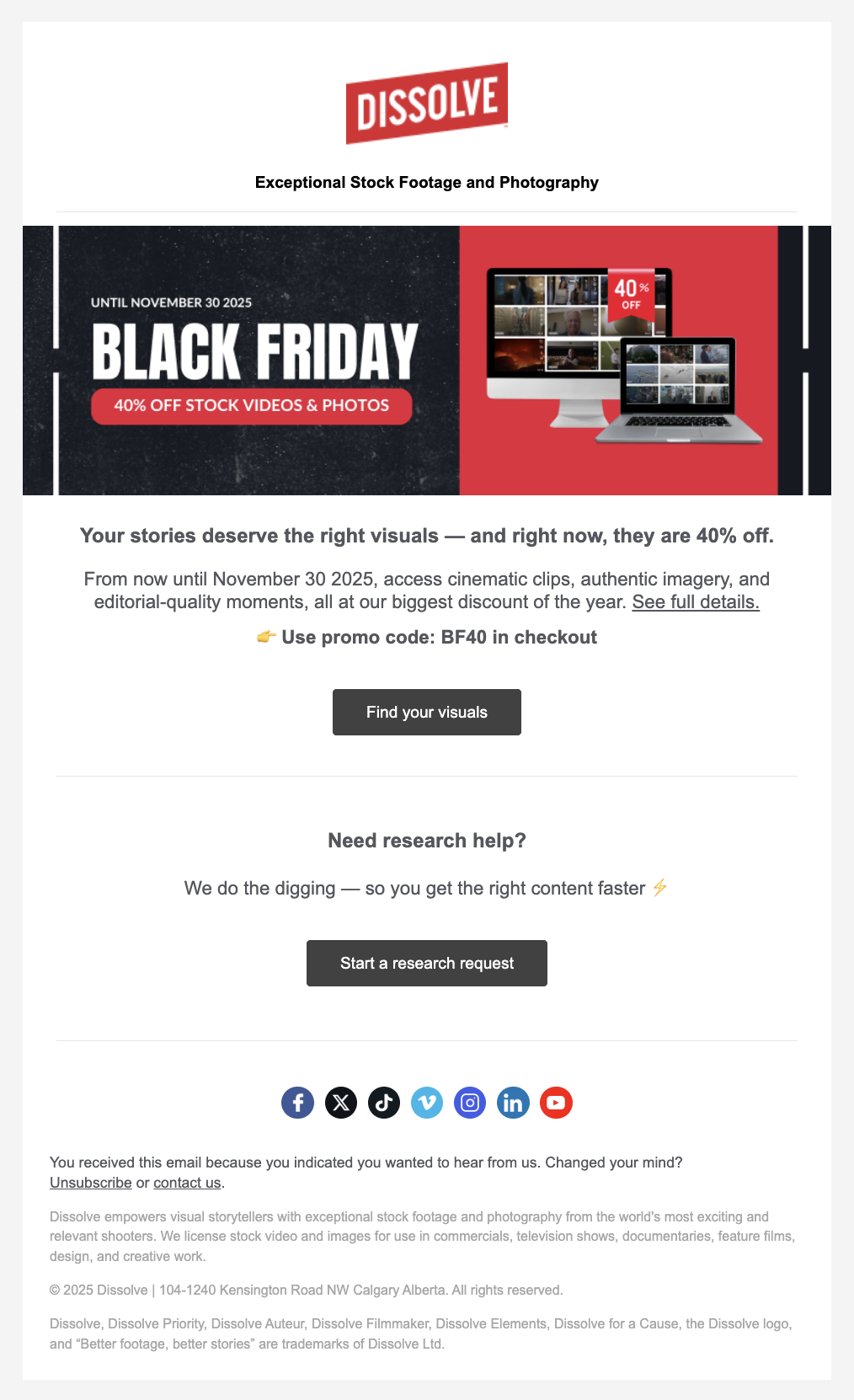
The campaign built around a bold Black Friday visual language using Dissolve’s red, black and white brand palette.
The primary creative paired oversized BLACK FRIDAY typography with cinematic stock imagery and a prominent 40% off message. The visual treatment was designed to immediately communicate the promotion while reinforcing what Dissolve sells: high-quality visual content for storytellers.
The email hierarchy was intentionally simple:
Black Friday → 40% Off → Promotional Details → Promo Code → Find Your Visuals
This allowed customers to understand the offer quickly before moving directly toward the primary CTA.
Campaign Timeline
The Black Friday promotion was supported by a series of targeted email touchpoints throughout November. Each send maintained the same core visual system while allowing for small adjustments to creative, messaging and promotional emphasis as the campaign progressed.
NOV 12 — Campaign Launch
Introduced the 40% off offer and established the campaign's visual direction.
15.89% reported open rate · Highest-performing send
NOV 13 — Early Promotion
Continued the promotion with subtle creative and messaging adjustments while reinforcing the offer and CTA.
NOV 25 — Final Week
Shifted the emphasis toward urgency as the November 30 deadline approached.
11.46% reported open rate
NOV 26 — Final Push
Reinforced the limited-time offer with another deadline-focused touchpoint.
12.59% reported open rate
Across the campaign, each email reached approximately 5,000 recipients, providing a consistent audience for evaluating engagement throughout the promotional period.
Performance & Outcome
The campaign reached approximately 5,000 customers per send, with engagement varying throughout the promotional period as the Black Friday deadline approached.
The strongest reported open rate came from the November 12 campaign at 15.89%, while the November 13 send generated the highest reported click rate at 3.59%. Engagement increased again during the final week, with the November 25 and 26 sends reaching 11.46% and 12.59% open rates, respectively.
These results provided a useful basis for evaluating how timing, urgency and repeated promotional touchpoints influenced audience engagement.
The campaign successfully established a cohesive promotional system that could be adapted across multiple customer touchpoints without losing brand consistency.
Beyond the individual email designs, the project demonstrated my ability to connect creative direction with marketing objectives and performance data—using campaign results to understand audience response and inform future promotional communications.
What I learned
This campaign reinforced the importance of building flexibility into a strong visual system. By establishing a consistent foundation and making smaller adjustments across each send, I was able to keep the campaign cohesive while preventing the repeated promotion from feeling static.
Reviewing performance across multiple sends also showed me the value of timing and repetition in promotional campaigns. Engagement shifted throughout the campaign, with stronger response around the initial launch and again as the deadline approached.
Most importantly, the project strengthened my ability to connect design decisions with measurable marketing outcomes—using performance data not just to evaluate a campaign after launch, but to inform how future promotional communications could be approached.
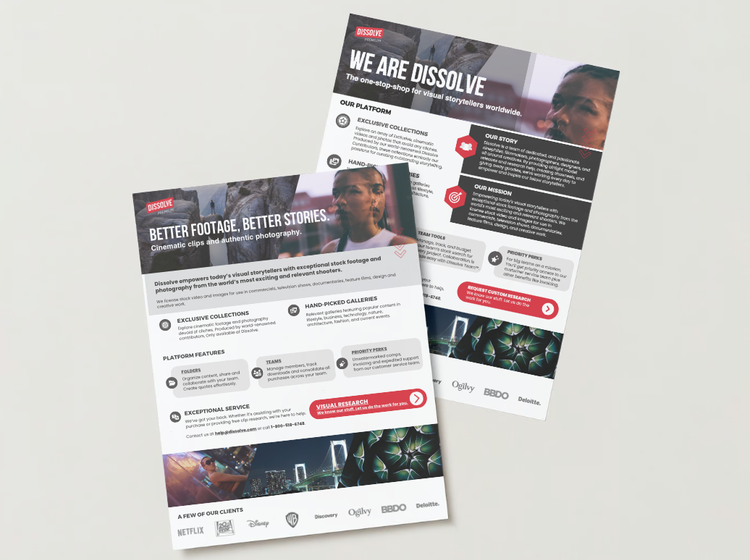
External materials
4.0
Social & video content
1.0
Showreels
Screenshot of Dissolve’s showreel page showcasing all of the latest reels.
At Dissolve, “showreels” have always been one of our primary marketing tools, designed to demonstrate the breadth and versatility of our stock content.
I led the creative direction for Dissolve’s showreels for over a year, beginning in Spring 2024. As one of our key marketing mediums, these reels play a central role in how we showcase our content across social media and email marketing.
With a library of over 2 million video clips and photos, it’s critical that we continuously surface fresh, relevant, and trending material. Working closely with video content creators, I guided edits, shaped concepts, and helped ensure each reel highlighted timely content while maintaining a consistent brand voice.
The showreels were published weekly across platforms including Instagram, Facebook, X, LinkedIn, YouTube, Vimeo, and TikTok, supporting ongoing visibility and engagement with our audience.
A Generic Gen Z Ad
Led concept and creative direction.
About a decade ago, the previous creative team developed a “Generic Millennial Ad” showreel that resonated widely by capturing a familiar tone and aesthetic of the time.
Seeing the impact of that piece (1.1M views), I began to wonder what a similar approach could look like for a new audience. Instead of focusing solely on story-specific reels, why not revisit the idea through a Gen Z lens? The goal was to create a culturally recognizable, “generic” ad-style video that reflected how this generation communicates visually and emotionally.
By reinterpreting that earlier concept, we could acknowledge a successful format and adapt it for today: showcasing the flexibility of our stock footage while staying relevant to shifting audience behaviours and creative trends.
Reached 5.5K views and outperformed recent showreels in engagement and watch time.
Eternal Night
Led concept and creative direction.
This showreel was released to align with the surge of online conversation and visual trends surrounding Nosferatu (2024). The goal was to tap into that cultural moment and curate stock footage that reflected the darker, atmospheric tone.
By responding quickly to a trending visual language, the reel demonstrated how stock content can stay relevant and adaptable to current cultural shifts. It reinforced Dissolve’s ability to surface timely, mood-driven material from a vast library and translate it into content that feels current, recognizable, and creatively usable for marketers and filmmakers.
“Drive Your Story Forward” was created as a bold, symbolic piece positioning Dissolve as the creative engine behind bold visual storytelling. I wanted to create something that could be shown anywhere, showcasing us a brand and the impactful stock content we sell.
Using striking red-toned footage and high-energy pacing, the showreel framed the brand itself as a catalyst: emphasizing motion, momentum, and creative possibility.
The goal was to move beyond simply showcasing clips and instead communicate a clear brand message: Dissolve is a go-to source for building stories, campaigns, and visual worlds.
Drive Your Story Forward
Led concept and creative direction.
Stock footage is everywhere—but where you get it makes all the difference. That was the central idea behind this showreel. Too often people assume “stock” means tired, generic clips; I wanted to challenge that assumption and show how stock can be fresh, cinematic, and full of character.
This showreel demonstrates that what looks like ordinary footage can be transformed into something remarkable when you start with exceptional material.
We’re not just another stock library — we’re the place to find footage that feels bespoke, elevated, and ready to make your project stand out. Choose better source material, and the rest falls into place.
See more showreels —>
This is Stock
Led concept and creative direction.