Honeydew Studios: Brand Identity
2023 - 2024
Brand Identity · Art Direction · Design Systems
Honeydew Studios began not with a product line or service offering, but with a feeling. We knew we wanted to build something meaningful.
I worked alongside two other designers to shape the studio’s identity, contributing to naming, visual direction, and the development of a flexible brand system. The goal was to build a brand that could stretch across mediums, evolve over time, and support future projects.
Overview
Timeline
+3 weeks
Toolkit
Milanote, Adobe Creative Suite
How might we create a compelling brand identity that balances handmade charm with creative credibility?
The challenge
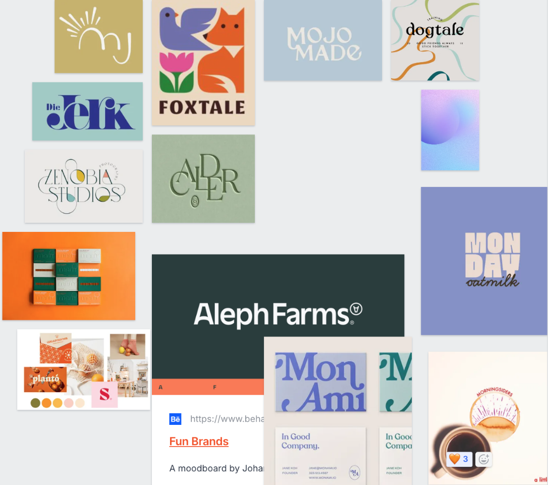
With Honeydew Studios, we were designing something entirely from scratch. We started with naming exercises, tone exploration, values, and creative references to define the brand’s foundation.
This involved collaborative exploration of mood, meaning, and future potential.
We kicked off with a naming sprint, gathering words that felt soft, tactile, and open-ended. Inspired by themes like fruit, nostalgia, nature, and colour, we curated dozens of options and reacted to each other’s suggestions in real time.
Our goal was to avoid anything overly polished. Instead, we leaned toward names that carried a natural and fresh feel.
The name Honeydew stood out right away. The process was organic, intuitive, and entirely collaborative, which perfectly reflected the tone we wanted the brand to carry forward. It felt like it could belong on a sticker or a studio door - refreshing and memorable.
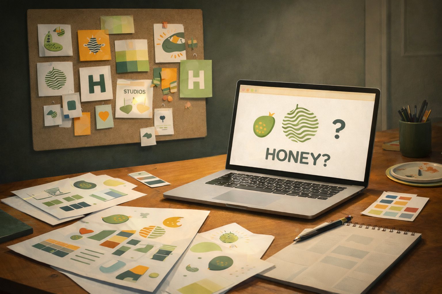
Initial brainstorming
Design process
Screenshot of initial brainstorming of aesthetic
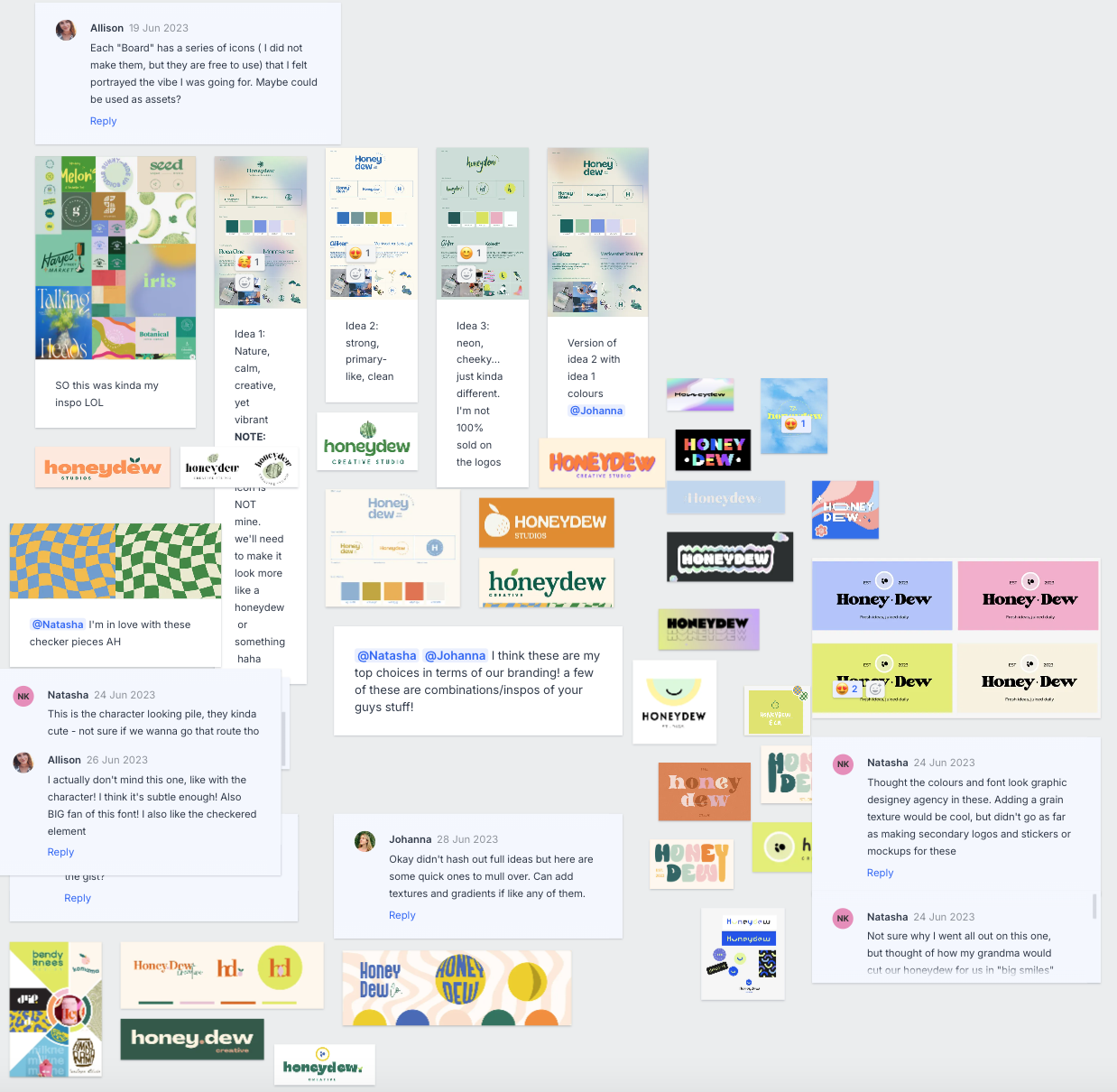
Screenshot of real-time collaboration of ideas
Next, we evaluated everything from type to texture, vibrancy, and tone, aiming to strike the right balance between softness and clarity. The collaborative nature of this stage helped us distill the visual essence of Honeydew, giving us a strong foundation to build the final identity.
As we moved deeper into the process, our focus shifted from broad exploration to refining the Honeydew brand identity. We tested subtle variations in logo form, iconography, and type pairing (adjusting spacing, weight, & accessibility). The goal was to strike the perfect balance between playfulness and professionalism, ensuring the identity could feel charming without being overly whimsical.
We also refined the colour palette, narrowing it to a selection of hues that felt grounded yet expressive. Greens, creams, and melon tones were tested across backgrounds and layout scenarios to assess contrast, readability, and emotional tone. We wanted the brand to be accessible: scalable and easy to identify.
These boards show late-stage versions, how the parts worked together, and the system’s flexibility. From here we chose the direction that best fits the brand’s long-term vision.
Logo refinement
Design process
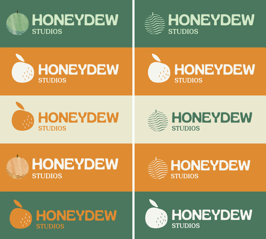
Screenshot of Honeydew icon variations
Screenshot of colour variations
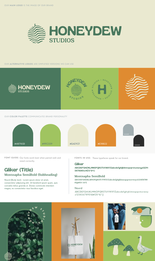
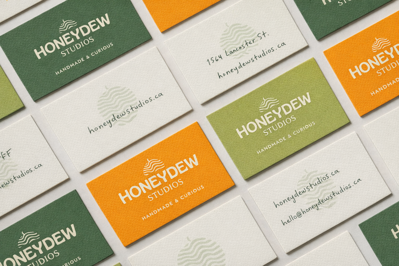
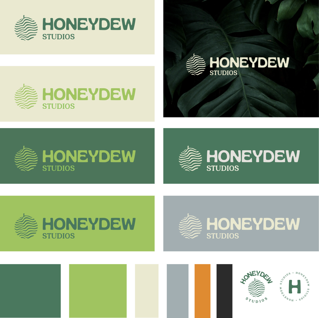
The brand identity system included:
Primary and alternative logos, including an abstract “melon” icon
A muted yet expressive color palette: Evergreen, Cream, Melon Orange, and Blush
A type system with character—anchored by playful serif details and structured sans-serifs
Visual guidelines and mood references to help shape product and content down the line
We designed the brand to evoke a sense of calm creativity—something handmade, but not homespun.
Final result
Design solution