Dissolve: Landing Page Redesign
2025
UX Design · Conversion Strategy · Visual Design
As a prominent stock content provider, Dissolve regularly launches campaigns aimed at filmmakers, marketers, and content creators. The marketing team needed a landing page design that was clear, modular, and easy to update without reinventing the structure each time.
I led the redesign of a reusable landing page template that could flex across different campaign goals, from driving purchases to collecting leads or guiding users toward resources. The system included: adaptable content blocks, promotional banners, responsive layouts, and clear call-to-action areas, all aligned with Dissolve’s modern, cinematic brand.
Overview
Timeline
+4 weeks
Toolkit
Trello, Adobe Creative Suite, Figma, Userbrain
How might we improve the structure and usability of Dissolve’s landing pages so users can quickly understand, navigate, and take action?
The challenge
The design process began with reviewing existing landing pages (ours as well as competitors) to identify pain points and opportunities for increasing usability.
I mapped common campaign needs and translated them into a modular structure that could support different goals while remaining easy to update. This included: current promotions being run, new exclusive galleries, showreels & short films.
Pain points:
Site-wide promotions aren’t visible
Objectives get lost (where’s fresh and trending content?)
AI-generated content not highlighted in stock footage
Opportunities:
Dissolve’s updated product offerings aren’t being shown
Modernize the site
Better communicate Dissolve’s expanded capabilities
Pain points and opportunities
Design process
As AI began reshaping the stock content space, staying competitive with industry leaders like Shutterstock, Adobe Stock, and Pond5 became critical. We focused on surfacing timely, high-quality content while maintaining pricing that felt accessible and market-aware.
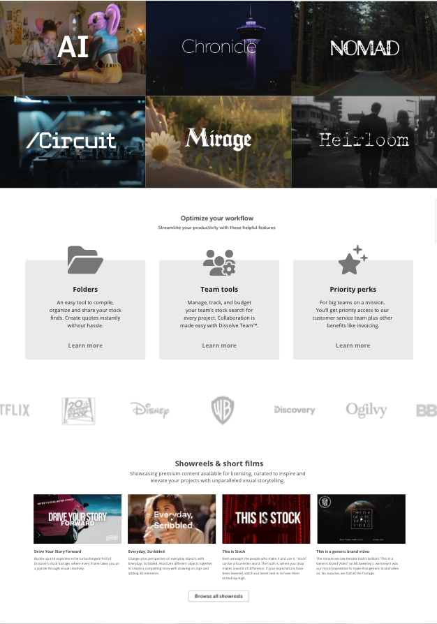
Our team also recognized the importance of keeping showreels at the forefront of our marketing. They were a defining differentiator for Dissolve: bringing our curated library to life in a way competitors couldn’t replicate.
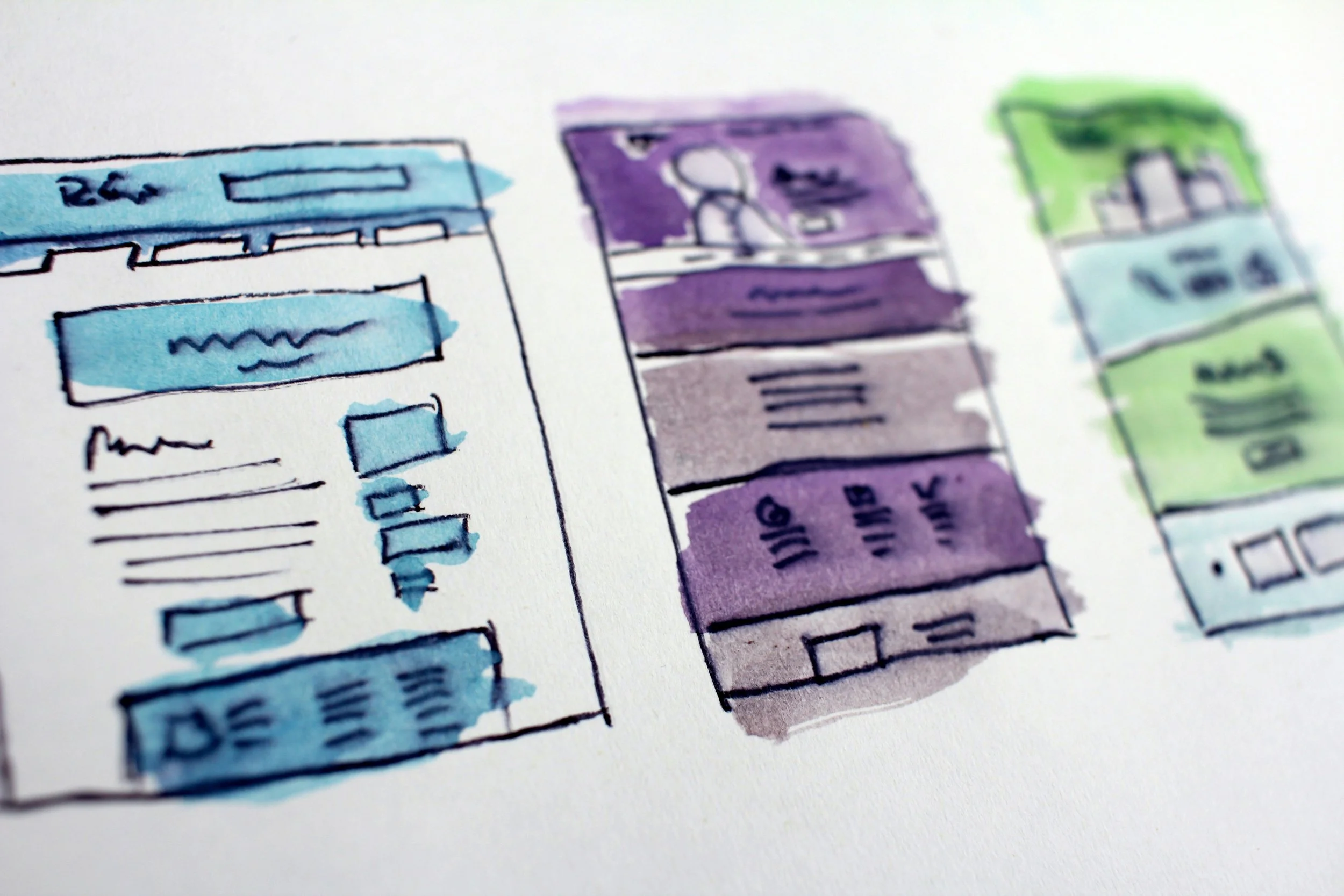
From there, I developed wireframes and layout systems centered on clarity, hierarchy, and strong calls to action. The final template was shaped through iteration and close collaboration, resulting in a flexible framework that balanced marketing goals with a clear, intuitive user experience.
Wireframes and mockups
Design process
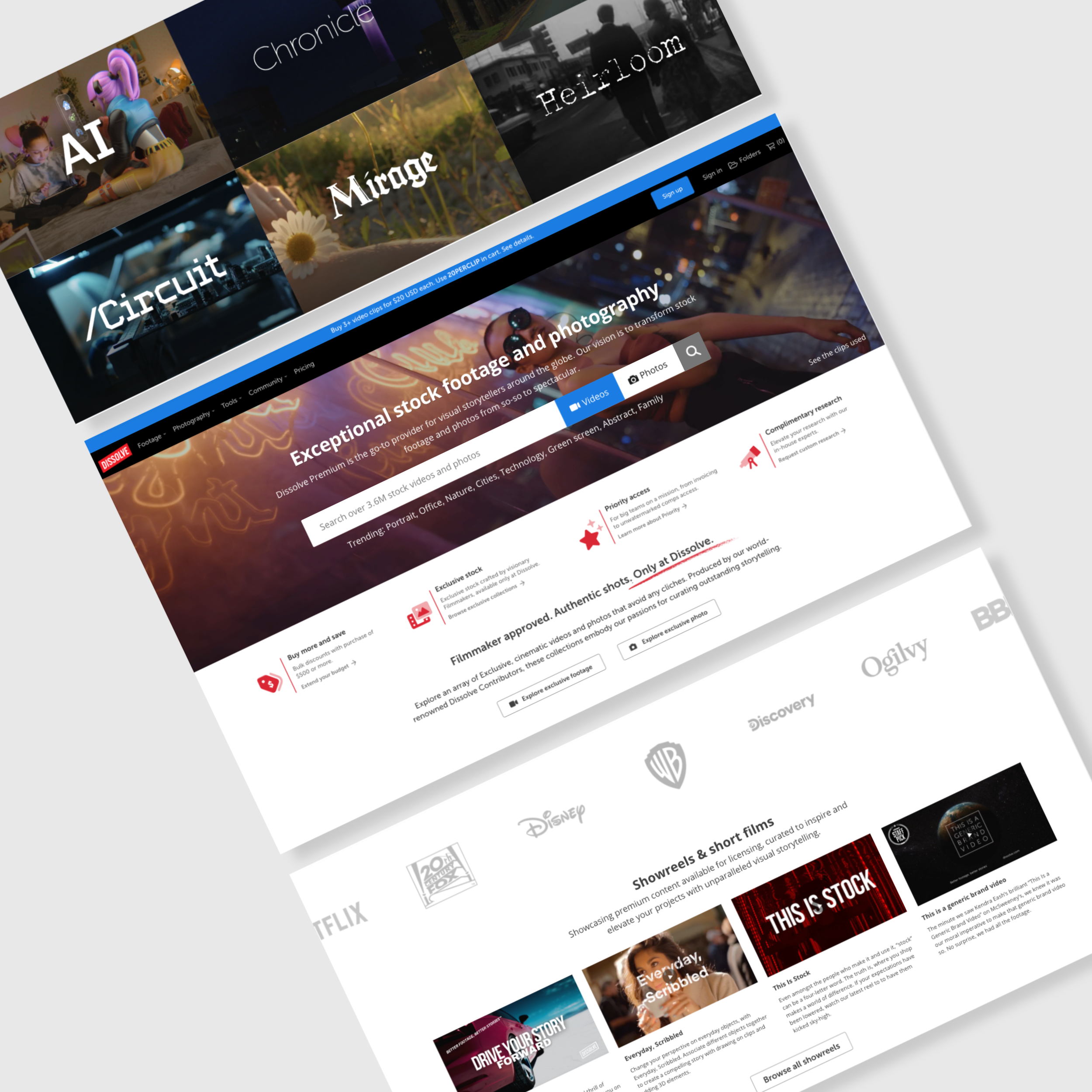
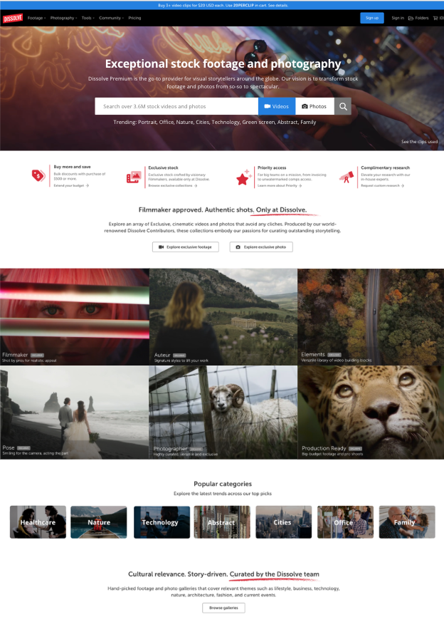
The final landing page solution included:
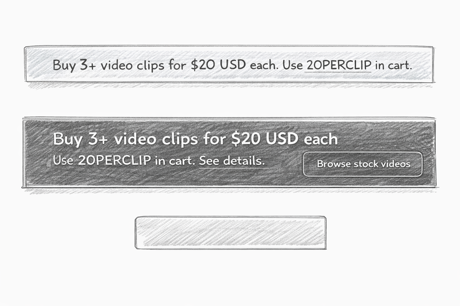
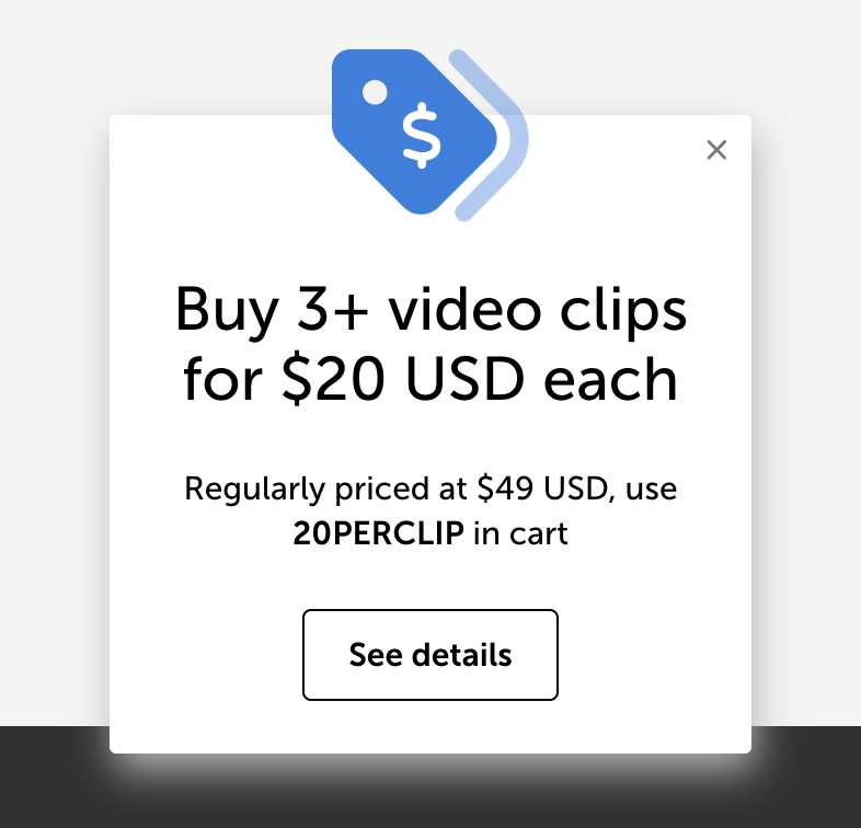
A blue global banner spanning all pages, designed with standardized styling so messaging could change quickly while maintaining a consistent visual presence.
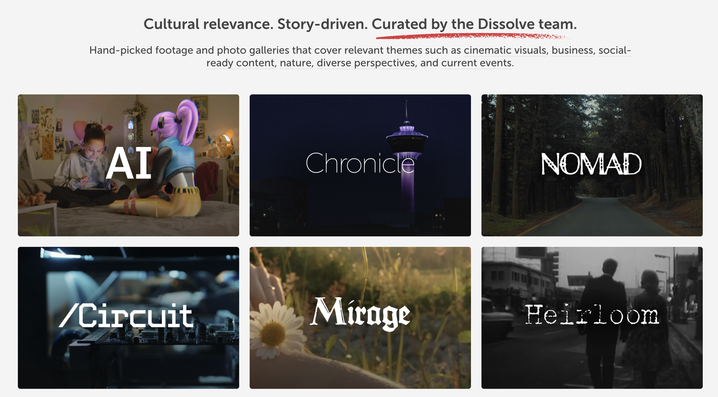
See how this was utilized in ongoing promotional campaigns —>A grid of exclusive galleries built to feel immersive and editorial, each one just a click away from fresh, cinematic content. The tiles were structured for easy backend updates, allowing the marketing team to keep content current without redesigning layouts.
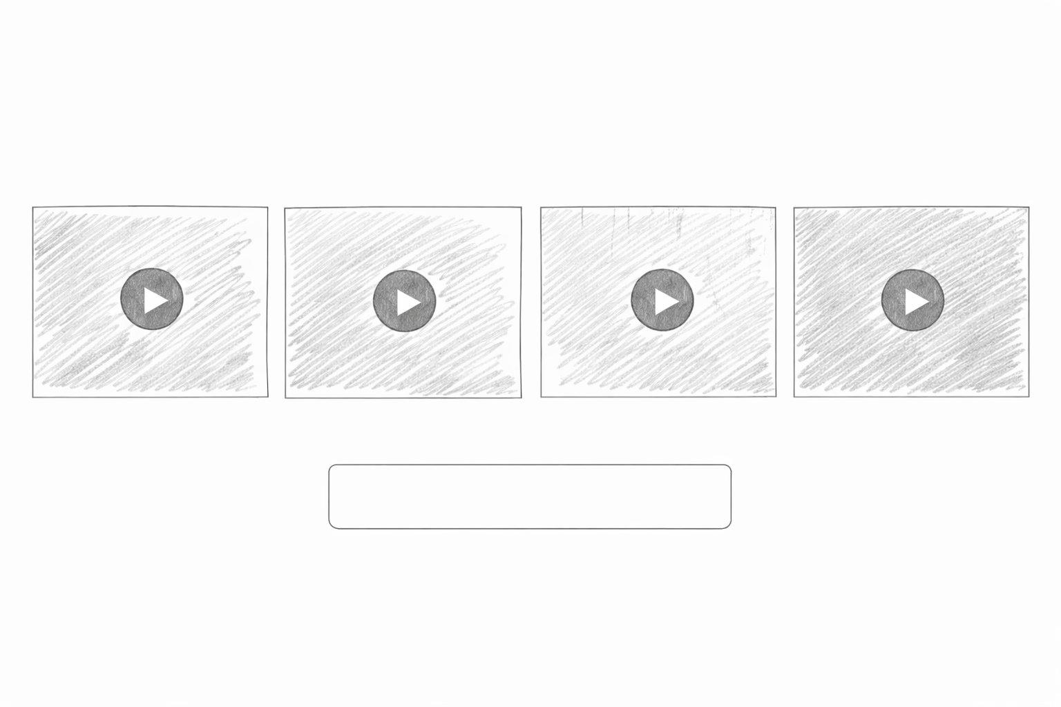
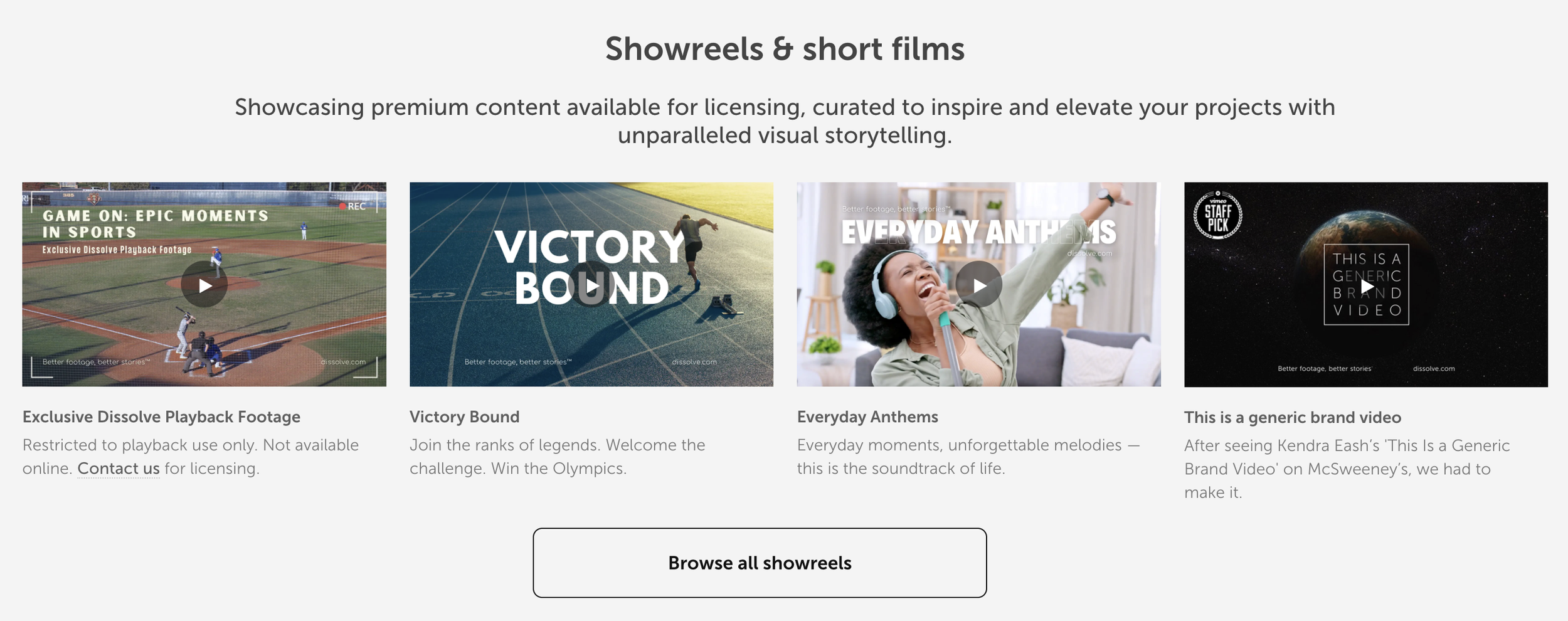
A dedicated “Showreels & short films” strip that dynamically pulled in the latest releases from our main showreels page, ensuring new work was always surfaced and the page stayed relevant over time.
Final result
Design solution
A sneak peak how the site looked back in ~2020.
